
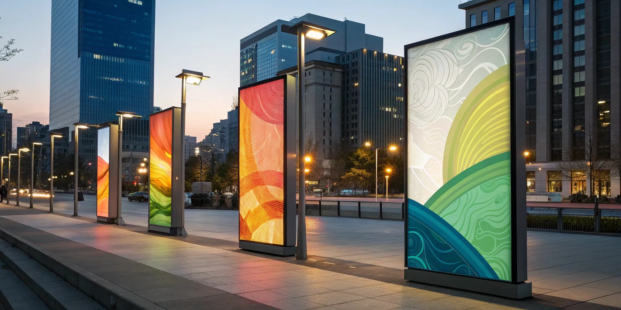
In a marketing world filled with complex digital strategies and massive outdoor displays, it’s easy to overlook some of the most effective tools. The vertical advertising banner is one of those unsung heroes. It’s not as flashy as a full-motion video wall, but its strength lies in its simplicity and versatility. This format is perfectly suited for place-based media, allowing you to connect with consumers during meaningful moments in their day. Whether standing in a lobby, waiting for an appointment, or working out at the gym, people have time to engage with a well-designed message. We’ll cover how to master this format, from choosing the right materials to creating a design that stops people in their tracks.
Key Takeaways
- Think Beyond Traffic—Think Dwell Time: A vertical banner’s power comes from its ability to fit into high-dwell areas where audiences are captive. Focus on placement in waiting rooms, lobbies, and checkout lines to ensure your message is seen and absorbed, not just passed by.
- One Goal, One Message: The most effective banners avoid clutter. Define a single objective for your banner and build your design around it with a clear headline, a strong image, and one direct call to action to ensure your message is understood instantly.
- The Right Material Protects Your Investment: Your banner's material affects its appearance and lifespan. Choose durable vinyl for high-traffic indoor or outdoor spots and elegant fabric for upscale environments to maintain brand quality and get the most out of your campaign.
What Is a Vertical Advertising Banner?
A vertical advertising banner is exactly what it sounds like: a tall, narrow display designed to catch the eye. Its portrait orientation is its superpower, allowing it to deliver a powerful message in a compact footprint. Think of it as the perfect solution for advertising in places where a sprawling horizontal sign just won’t fit. Because they command attention without overwhelming a space, vertical banners are a smart choice for reaching people in their daily environments.
This format is especially effective in the kinds of high-traffic, high-engagement venues that make up place-based media networks. Whether it’s standing next to the check-in desk at a fitness center, in the lobby of a medical clinic, or near the entrance of a busy restaurant, a vertical banner meets consumers where they are. It’s a focused, effective way to communicate your message directly to a captive audience, making it a versatile tool for any campaign.
Vertical vs. Horizontal Banners
The main difference between vertical and horizontal banners is their orientation and how that influences their function. Vertical banners, like retractable or pull-up stands, are designed to stand tall. They’re ideal for concise, impactful messaging that can be absorbed quickly. Because of their smaller footprint, they work well as standalone advertisements or directional cues in tight spots.
Horizontal banners, on the other hand, are wider than they are tall. Think of large pop-up displays often used as backdrops for trade show booths or event stages. They are built to fill a wide space and often contain more extensive graphics or branding. Choosing between the two depends entirely on your goal and your environment. For targeted messaging in specific, high-dwell-time locations, vertical is the way to go.
Why Go Vertical? The Main Benefits
Opting for a vertical banner comes with some distinct advantages. First and foremost is their space efficiency. They can be placed in hallways, entryways, or along walls without disrupting foot traffic, making them perfect for busy venues. Their height naturally draws the human eye up and down, ensuring your message gets noticed even in a crowded room.
Vertical banners are also incredibly versatile. You can use them to announce a limited-time sale, list a menu of services, promote daily specials, or simply direct people where to go. This flexibility allows them to support a wide range of campaign objectives, from building brand awareness to driving a specific action. They deliver a clear, focused message right where your audience has time to see it.
Where Vertical Banners Shine
Vertical banners are at their best in environments where space is at a premium but audience engagement is high. They are staples at trade shows, conferences, and retail stores for this very reason. But their effectiveness extends far beyond temporary events. They are a powerful tool in any location where people spend time, like gyms, waiting rooms, community centers, and cafés.
Because they can be produced on different materials, they are suitable for both indoor and outdoor placements, giving you more options for your campaign. Imagine your banner catching the eye of someone waiting for their appointment or standing in line for a coffee. These are the moments when a well-placed, compelling message can truly make an impact and connect with potential customers.
Find the Right Vertical Banner for Your Campaign
The material and construction of your banner are just as important as the message printed on it. The right choice ensures your ad not only looks great but also holds up in its intended environment, whether that’s a bustling gym lobby or a sun-drenched outdoor plaza. Choosing the wrong type can lead to a wrinkled, glaring, or damaged display that undermines your brand’s credibility. Let’s walk through the four most common types of vertical banners so you can match the medium to your message and venue perfectly. Each has its own strengths, and understanding them is key to a successful place-based media campaign.
Pop-Up Banners
If you need a banner that’s incredibly easy to transport and set up in minutes, the pop-up banner is your best friend. These displays literally "pop" into shape from a folded position and are often printed on both sides, giving you double the visibility. This makes them a fantastic choice for temporary events like trade shows, community health fairs, or weekend retail promotions. Their lightweight design and quick assembly mean anyone can set them up without tools or trouble, ensuring your message gets seen from multiple directions in a busy space.
Retractable Banner Stands
Also known as pull-up or roll-up banners, retractable banners offer a professional look with unmatched convenience. The banner graphic pulls up from a sturdy aluminum base and is held in place with a support pole. This design not only makes for a quick setup but also protects the graphic during transport and storage. Retractable banners are ideal for recurring use in semi-permanent locations like corporate lobbies, bank branches, or conference check-in areas. Their durability and polished appearance make them a reliable tool for any brand awareness campaign.
Fabric Banners
For a high-end, elegant indoor display, fabric banners are the way to go. Their soft, matte finish eliminates glare, making your graphics look vibrant and clear under any lighting conditions—perfect for upscale retail environments, museum exhibits, or office interiors. Fabric is lightweight, wrinkle-resistant, and often machine-washable, so it’s easy to maintain and transport. The sophisticated texture of the material adds a touch of quality to your message, helping your brand put its best foot forward in environments where aesthetics matter.
Vinyl Banners
When you need a durable, all-weather workhorse, vinyl is the answer. Vinyl banners are built to last, making them an excellent choice for both long-term indoor displays and outdoor placements. Their strength and resistance to the elements ensure your message remains sharp and compelling, even in high-traffic areas or less-than-ideal conditions. Typically printed with a matte finish to improve visibility and reduce glare from a distance, vinyl banners are perfect for gyms, arenas, outdoor shopping centers, and any other venue where you need your campaign to have serious staying power.
Customize Your Banner to Make an Impact
A great banner does more than just display a logo; it captures attention and communicates a message clearly and quickly. In place-based advertising, your banner becomes part of the environment, so customizing it to fit the specific venue is crucial for success. The right combination of size, material, and design ensures your ad feels like a natural part of the space while still standing out to your target audience.
Making smart choices upfront will make your campaign more effective and your investment go further. From the durable vinyl needed for a busy gym to the elegant fabric that works in a doctor's office, every detail matters. Let’s walk through the key elements you can customize to create a banner that truly connects with people where they are.
Choosing the Right Size and Dimensions
The first step is matching the banner’s size to its future home. Vertical banners are a fantastic option because their tall, narrow shape fits perfectly in spaces where horizontal ads just won’t work. Think about the high-traffic but tight areas within a venue—like hallways, entryways, or alongside equipment at a fitness center. A vertical banner can command attention in these spots without disrupting the flow of the space. Before you decide, consider the viewing distance and the surrounding environment. The goal is to select dimensions that are large enough to be noticed but scaled appropriately for the location.
Selecting Materials for Your Environment
The material you choose affects both the look and the lifespan of your banner. Your decision should be based on where the banner will be placed—indoors or outdoors—and the atmosphere of the venue. Durable vinyl is a go-to for most indoor applications, as it’s easy to clean and holds up well in busy areas like restaurants or community centers. For outdoor placements or areas with a lot of wind, a mesh banner allows air to pass through, preventing it from tearing. If you’re aiming for a more premium feel, such as in a corporate lobby or a quiet healthcare facility, a soft fabric banner offers a sophisticated, glare-free finish.
Single vs. Double-Sided Printing
Will people see your banner from one direction or multiple? Answering this question will help you decide between single-sided and double-sided printing. For banners placed flat against a wall, single-sided printing is the practical and cost-effective choice. However, if your banner will hang in an open space, a wide hallway, or a busy lobby, double-sided printing is a smart investment. It doubles your ad’s visibility, allowing you to capture the attention of people coming and going. This simple choice can dramatically increase your campaign’s exposure without needing additional placements.
Key Design Elements for Engagement
A powerful design is simple, clear, and focused. The biggest mistake brands make is trying to say too much. In a high-dwell environment, you have a few key moments to make an impression, so your message needs to be instantly understood. Use bold, high-contrast colors to make your text and images pop. Stick to one clear call to action and keep your layout clean and uncluttered. An effective visual hierarchy guides the viewer’s eye from the most important information—like your headline or offer—down to your logo or website. Remember, clarity always wins.
Avoid These Common Vertical Banner Design Mistakes
A brilliant campaign concept can fall flat if the execution is flawed. When it comes to vertical banners, design isn't just about making something look good; it's about communicating a message quickly and effectively to people on the move. Even in high-dwell environments where audiences are more captive, you’re still competing for attention. Simple design mistakes can make your banner invisible, confusing, or unprofessional, undermining your entire investment.
The goal is to create a visual that stops people in their tracks and delivers a clear, memorable message in seconds. This requires a thoughtful approach that balances creativity with clarity. From the fonts you choose to the amount of information you include, every decision impacts your banner's performance. By sidestepping a few common pitfalls, you can ensure your creative assets are primed for success and ready to make a real impact. A well-designed banner in a strategic place-based media network doesn't just get seen—it gets results. Let's walk through the most frequent design errors so you know exactly what to avoid.
Unreadable Fonts and Poor Typography
It’s tempting to use a unique, stylized font to stand out, but if people can't read it, your message is lost. The number one rule of banner typography is legibility. Choose clean, bold fonts that are easy to read from a distance. Sans-serif fonts like Helvetica, Arial, or Futura are often safe bets for headlines and key information. While a decorative font might work for a single word, avoid using it for entire sentences. Remember to also consider font size and spacing. The text needs to be large enough to be seen from several feet away, and proper spacing between letters and lines prevents words from blurring together. Your typography choices should always serve the message, not distract from it.
Cluttered Layouts and Too Much Information
A banner is not a brochure. Trying to cram too much text, multiple images, and several logos onto a single vertical banner is a recipe for a cluttered mess. When a viewer is overwhelmed with information, they tend to tune it all out. Instead, embrace the power of simplicity. A successful banner design focuses on a single, compelling message. Use a powerful headline, a striking high-resolution image, your logo, and a clear call to action. Generous use of negative space (the empty areas around your design elements) is crucial. It gives your message room to breathe, improves readability, and helps guide the viewer's eye directly to the most important information on the banner.
Low-Contrast Colors
Color is a powerful tool for grabbing attention, but poor color combinations can render your banner unreadable. The most common mistake is using colors with low contrast between the text and the background. Think light gray text on a white background or dark blue on a black background. The text will simply fade into the design, especially from a distance or in certain lighting conditions. Always aim for high contrast to ensure your message pops. Dark text on a light background or light text on a dark background are classic, effective combinations. You can use a free online contrast checker to test your color pairings and ensure they meet accessibility and readability standards before going to print.
Vague Messaging and Weak CTAs
Your banner has just a few seconds to make an impression, so your message must be sharp, concise, and instantly understandable. Avoid vague headlines or industry jargon that the average person won't get. Your copy should clearly communicate a key benefit or a compelling offer that resonates with your target audience. Just as important is a strong call to action (CTA). Don't leave viewers wondering what to do next. Tell them directly: "Scan to Win," "Visit Our Website," or "Ask for a Free Sample." A banner without a clear, actionable CTA is a missed opportunity to turn a passive viewer into an active lead or customer. Your CTA is the bridge between seeing your ad and engaging with your brand.
Place Your Banners for Maximum Visibility
A brilliant banner design can only do its job if people see it. That’s why placement is just as critical as the creative itself. Where you position your banner determines who sees your message and how they interact with it. Simply choosing a busy location isn’t enough; the right placement considers foot traffic patterns, sightlines, and the viewer’s mindset. By thinking strategically about where your banner lives, you ensure your investment connects with the right audience at the right moment, turning a simple sign into a powerful point of engagement for your brand.
Placement Strategies for High-Traffic Venues
Putting your banner in a high-traffic venue is a great start, but its specific location within that space makes all the difference. Think about the natural flow of the environment. Where do people’s eyes go when they walk in? Where do they pause or wait? Placing banners near entrances, reception desks, checkout counters, or in waiting areas capitalizes on moments of high visibility and dwell time. The goal is to integrate your message seamlessly into the consumer’s path. A well-placed banner feels like a natural part of the scenery, making it more likely to be noticed and absorbed without feeling intrusive. This is the core of effective place-based media.
Indoor vs. Outdoor Placement
The environment dictates the physical makeup of your banner. For outdoor placements, durability is everything. Your banner needs to withstand sun, wind, and rain without fading, tearing, or becoming unreadable. This means choosing weather-resistant materials like heavy-duty vinyl and ensuring the stand is secure. For indoor banners, you can focus more on aesthetics and specific use cases. While you don’t need to worry about weather, you should consider factors like fire safety regulations and the finish of the material. A matte finish, for example, can reduce glare from indoor lighting, making your message easier to read from different angles.
Factoring in Light and Environment
Lighting can make or break your banner's effectiveness. A design with intricate details or low-contrast colors will get lost in a dimly lit space, like a cozy restaurant or bar. Conversely, a glossy banner placed under direct spotlights in a bright gym will create a glare that obscures your message. Before finalizing your design, assess the lighting conditions of your chosen venue. Opt for bold, high-contrast designs for lower-light settings and consider a matte finish for brightly lit areas. Also, take stock of the surrounding visual noise. Your banner needs to stand out from competing signage and decor to capture attention.
How Banners Fit Into Your Overall Campaign
Your vertical banner shouldn’t be an afterthought; it should be a strategic piece of your larger marketing puzzle. Before you even start designing, you need to have clear goals for what you want the banner to achieve. Is its purpose to build brand awareness, announce a new product, or drive traffic to a special event? The objective will influence both the design and the placement. A banner with a QR code leading to a special offer, for instance, is best placed in a high-dwell area where people have time to pull out their phones, like a café or a doctor's office waiting room. Integrating your banner’s role into your campaign ensures it works harder for you.
Design Best Practices for Effective Vertical Banners
Once you’ve chosen the right banner type and location, the design takes center stage. An effective vertical banner does more than just exist in a space; it grabs attention, communicates a message clearly, and prompts action. In high-dwell environments where you have a captive audience, a strong design is your best tool for making a memorable impression. Here are the core principles to follow to ensure your banner design works as hard as you do.
Create a Clear Message Hierarchy
Viewers will only give your banner a few seconds of their attention, so you need to make it count. A clear message hierarchy ensures they grasp the most important information instantly. Start with a powerful, concise headline at the top in a large, bold font. This is your hook. Below that, add a brief sentence or two with supporting details. Finally, place your logo and a clear call to action (CTA) at the bottom. This top-to-bottom structure guides the eye naturally. To avoid a design that confuses viewers, stick to this simple formula: Headline, Value Proposition, CTA. This keeps your message focused and easy to digest at a glance.
Balance Text and Imagery
The best banner designs strike a perfect balance between visuals and words. A single, high-quality, compelling image can convey emotion and context far faster than text alone. But without copy, your message can be ambiguous. The key is to make them work together. Choose one hero image that directly relates to your headline and avoid busy backgrounds. Keep your text minimal and impactful. One of the most common missteps is creating a text-heavy banner ad that overwhelms the viewer and makes them tune out. Let your image do the talking and use your words to provide essential details and a clear call to action.
Guide the Eye with Visual Flow
A great banner design feels intuitive. It directs the viewer’s gaze effortlessly from one element to the next, telling a story in a split second. Most people in Western cultures read from top to bottom and left to right, so your layout should follow this natural path. Place your headline at the top, your key visual in the middle, and your CTA and logo at the bottom. You can also use visual cues like lines, arrows, or the direction a person in a photo is looking to guide the eye. A banner with poor design quality often lacks this intentional flow, making the message feel disjointed and difficult to process quickly. Keep it clean, organized, and logical.
Connect to Digital with QR Codes
Your vertical banner is a powerful physical touchpoint, but it can also be a gateway to your digital world. Adding a QR code is a simple and effective way to bridge this gap, especially in places where people have time to pull out their phones. Don’t just place a QR code on the banner; give people a compelling reason to scan it. Use a short, action-oriented phrase like, “Scan to Join Our VIP List” or “Get Your Coupon Here.” It's a common digital advertising mistake to neglect the copy around the QR code. Make sure the code is large enough to be scanned from a distance and links to a mobile-friendly landing page for a seamless user experience.
Choose the Right Partner for Your Banners
Your vertical banner is only as effective as the team that produces and places it. A great design can fall flat if it’s printed on flimsy material or installed incorrectly. Choosing the right partner is about more than just finding a printer; it’s about finding a team that understands your campaign goals and can handle the logistics from start to finish. A true partner ensures your message not only looks great but also gets seen by the right people in the right places, without adding extra work to your plate. They’ll guide you through material selection, manage production timelines, and ensure every banner is placed for maximum impact.
What to Look for in Quality and Materials
The first sign of a quality partner is their attention to materials. They won’t just ask what you want to print; they’ll ask where your banner will live. Is it going in a sun-drenched window, a busy gym, or an outdoor event? The environment dictates the material. For outdoor placements, you’ll want durable vinyl with UV-resistant inks that won’t fade after a week in the sun. For indoor settings, a premium fabric banner might offer a more sophisticated, glare-free finish. A knowledgeable partner will walk you through options like vinyl, mesh for windy conditions, and fabric, helping you select the perfect canvas for your message and venue.
Understanding Pricing and Timelines
When it comes to pricing, transparency is key. While some printers might advertise rock-bottom prices, it’s important to understand what’s included. Does the price cover finishing options like grommets or pole pockets? What about shipping? A reliable partner will provide a clear, all-in quote. Timelines are just as critical. If you have a hard launch date, you need a partner who can guarantee delivery. While some companies offer incredibly fast turnarounds, be sure to confirm production and shipping schedules upfront. This is especially important for multi-location campaigns where banners need to arrive at different venues across the country on a specific schedule.
Reviewing Warranties and Policies
A partner who stands behind their work will have clear warranties and satisfaction policies. Look for guarantees that protect your investment. For example, some suppliers offer a one-year warranty on their products or a promise that you'll be 100% happy with your purchase. This gives you peace of mind that the banners will hold up and that you have recourse if something goes wrong. Before you sign off, ask about their policy on reprints for printing errors or replacements for items damaged during shipping. A great partner will make the process seamless, handling any issues without causing you headaches.
How to Get the Best Value
Getting the best value isn’t about finding the cheapest banner—it’s about maximizing your return on investment. A strategic partner helps you do this by thinking beyond the print job. They might suggest adding grommets to make your banner more durable and reusable for future campaigns. Or they might recommend a specific type of stand to ensure your banner is stable and visible in a high-traffic walkway. Ultimately, the greatest value comes from a partner who offers a turnkey solution, managing everything from strategic venue selection and printing to nationwide installation and proof-of-performance. This frees you up to focus on the bigger picture while they handle the details.
Related Articles
- Anterior_Banner_24x60_FA - Digital Out of Home Advertising-All Points Media
- banner-cards - Digital Out of Home Advertising-All Points Media
- TriStar Summit - Digital Out of Home Advertising-All Points Media
- divider-bg-1080 - Digital Out of Home Advertising-All Points Media
- Digital Mobile Truck Billboard | All Points Media
Frequently Asked Questions
My campaign goal is brand awareness. How is a vertical banner better than a digital ad? A vertical banner in a strategic location offers a different kind of attention than a digital ad. While a digital ad can be scrolled past in a fraction of a second, a banner placed in a high-dwell environment like a waiting room or a fitness center becomes part of the scenery. It allows your message to be absorbed by a captive audience over several minutes, creating a more lasting impression without being disruptive. It’s a way to connect with people during moments in their day when they are relaxed and more receptive to new information.
What's the single most important design tip for a vertical banner? Focus on one single idea. The most common mistake is trying to cram too much information onto the banner, which just creates a cluttered design that people ignore. Decide on the one thing you want your audience to know or do, and build your design around that. A powerful headline, a striking image, and a clear call to action are far more effective than a long list of features or multiple offers. Simplicity is what makes your message stick.
Are these banners a one-time use thing, or can I reuse them? They are absolutely reusable, which is one of their biggest advantages. When you invest in a banner made from durable material like vinyl or a retractable stand with a protective base, you’re creating a marketing asset you can use for multiple campaigns. This makes them incredibly cost-effective for annual trade shows, seasonal promotions, or recurring events. A well-cared-for banner can be a reliable part of your marketing toolkit for a long time.
How do I make sure my banner gets noticed in a busy place like a gym or café? Success in a busy venue comes down to a combination of smart placement and strong design. Position your banner in natural sightlines where people tend to pause, such as near the entrance, beside the check-in counter, or in a waiting area. Then, use a design that cuts through the visual noise. High-contrast colors, a clean and uncluttered layout, and a bold, readable font will ensure your message stands out and grabs attention, even from a distance.
How can I connect my physical banner to my online marketing efforts? The best way to bridge the gap between your physical banner and your digital presence is with a QR code. But don't just slap a code on the design; give people a compelling reason to scan it. Offer an immediate reward, like a discount code, a free downloadable guide, or entry into a contest. Frame the QR code with a clear call to action like, "Scan for 15% Off Your First Order." This turns a moment of passive viewing into an active engagement with your brand online.